Onder de loep: menu's testen door gebruikers
Hoe komt de gebruiker op een landingspagina als hij het menu van een website gebruikt op een mobiel apparaat? Klik op de koptekst? Het chevron-pictogram? Heb je een extra menu-item nodig voor de landingspagina? Simpele vragen, banaal zelfs, maar als professioneel ontwerper moeten we ze op de een of andere manier oplossen. De beste manier om de bruikbaarheid van je projecten te verknallen is door niet naar de kleine dingen te kijken terwijl je bezig bent.
Mobile menus
Mobile menus are legion. Every responsively-designed website has a variant of their menu for display on mobile devices. Device usage continues to climb, and you can’t have an app for every site that you happen to visit once.
There is an established pattern for mobile menus: ‘click on the menu icon and the menu slides in from the left’. The menu will either cover the entire screen, necessitating a ‘close’ icon, or cover 80% or so of the screen, with the rest obscured by a transparent layer. Click on this layer to close the menu.
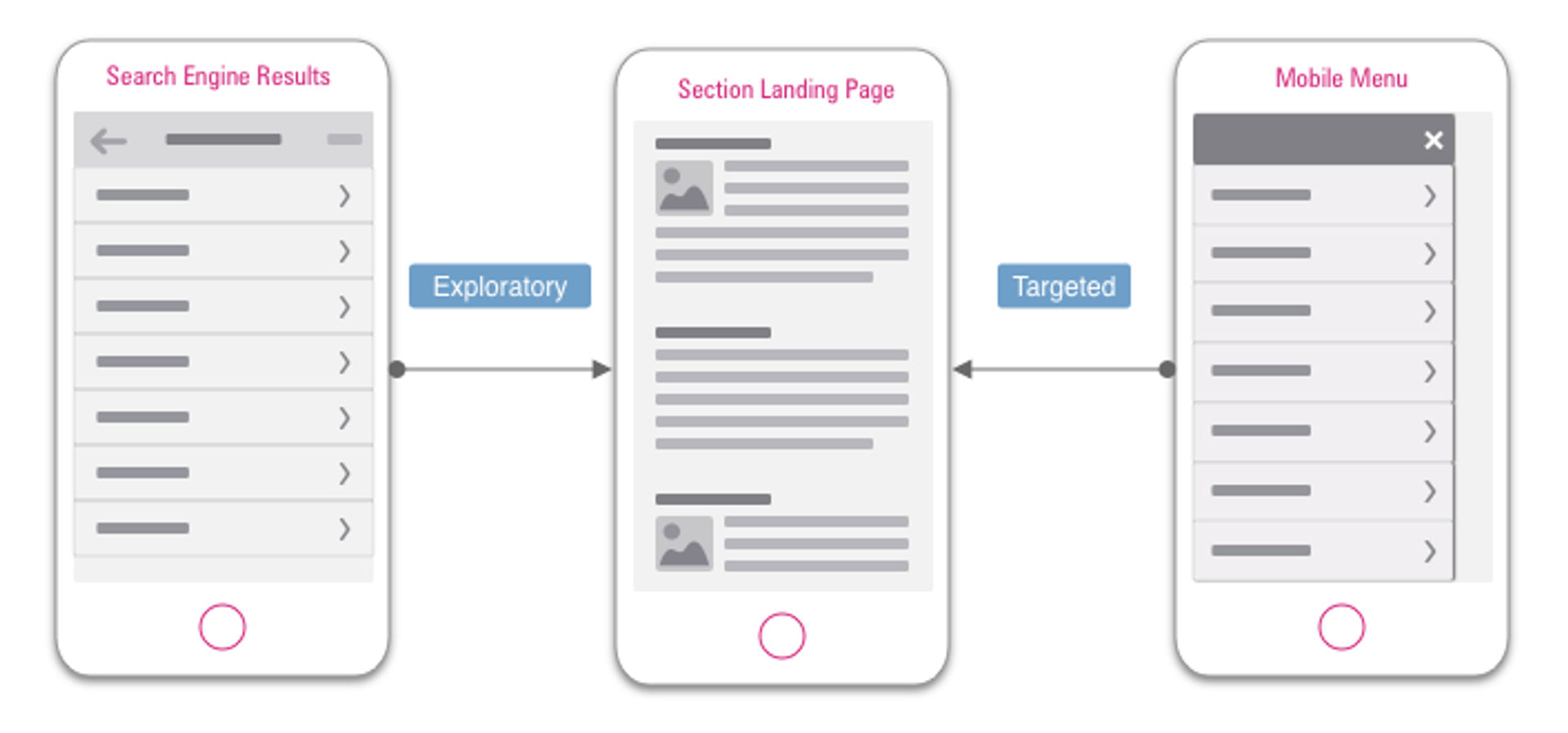
Beyond that, however, it’s a demilitarised zone. There are many ways to successfully communicate the architecture of your website to a visitor. Without a standard approach, every site has to develop their own interaction pattern.
Should menu items expand to show their children? Or should sub-menus appear as menus in their own right? How do you get to the landing page for a section or sub-section of the site? These landing pages may contain special offers or notifications of new or popular content, so the impact of poor design choices can be significant for users and organisations.
We hope that the results will provide insight into what patterns users find confusing or intuitive.
This study will look at websites that contain many categories of products or subject areas. It will attempt to determine how easy people find it to use the menu on mobile devices. Specifically, how easy it is to complete the task of navigating to the landing page of a section of the site.
Landing pages are necessary and often ‘hygienic’ part of a large site, which at its most basic contains links to the relevant sub-sections, as defined in the information architecture model of the site in question.
They can present profitable opportunities for both users and organisations, as they can contain important content that relates to the section as a whole.
Example
Consider the example of someone looking for a gift for their technology-minded niece or nephew.
Let’s say they have the idea of buying something electronic from Amazon. It’s reasonable to assume (and you can be sure that Amazon have planned this route) that they search the web for ‘amazon electronics’. This will provide our hypothetical user with a search results screen containing, among images and adverts for specific products, a link to the landing page for all of Amazon’s electronic products.
On this landing page our users will find links to the appropriate categories contained within the section (cameras, phones, speakers, etc.), but also a series of deals (phone trade-in schemes, featured deals, lightning deals) and popular products (best sellers, most wished-for, most gifted, etc.). This gives our user a wealth of choice, from which she can presumably find her way to an agreeable gift option.
Our user is happy, as she has completed her gift buying. The seller is happy as they have shipped another product. Amazon is happy as they have also profited from the encounter.
But… what if our hypothetical user was already on the amazon site?
Although we could argue the likelihood of this, given that frequent shoppers may have the Amazon app installed, and knowing that the app does not permit any sub-section navigation from it’s in-app menu (you go straight to the landing page), it’s is not however out of all reason.
What if our user searches the web for ‘amazon’ and uses the menu to navigate to the landing page?
Regardless, if you’re navigating to a section landing page you have a very different journey. What feels natural from a search engine results page feels like a cop-out on menu navigation.
The nature of menu navigation is to lead you to the most specific place for your search as possible. As such, it is not best suited to the exploratory approach taken by our hypothetical user.
But users are not robots, and will use whatever navigation methods have worked well for them in the past, or that they feel most comfortable with - the method with the lowest ‘interaction cost’.
Different ways of arriving at the same information
Before you see any information about deals or relative popularity of any products, you will have the full list of sub-categories (cameras, phones, speakers, etc.) to choose from. If a landing page is not visible to users at this point, then they may become frustrated and leave. "I don’t know which one of these I want, and I can’t see a way to help me choose”.
Okay, that’s the preamble out of the way, let’s get to the users!
Testing
We conducted an online, unmoderated first-click test using Optimal Workshops Chalkmark. We recruited 46 respondents from across the globe. The question we were exploring was ‘What are user’s expected interaction patterns of mobile menus?”.
We collected screenshots of the mobile menus from five websites, all expanded to a specific section. For each screenshot we asked respondents the following question:
“You want to see the landing page for everything to do with [section] on [website]. Where would you tap?”.
These tasks were presented in random order.
It’s not the perfect test. What will respondents make of the phrase ‘landing page’? Have we set the scene enough? Have we led them too much? A larger study with moderated multi-variate testing would help eliminate these unknowns. For our purposes, however, a simple ‘looking into the box’ will suffice.
You can see the five screenshots that we used for the study, below:
From left to right: Amazon.co.uk, next.co.uk, screwfix.com, urbanoutfitters.com, which.co.uk!
Results
It’s clear to see from the results that some approaches are more successful than others. Let’s look at the results in order of success rate:
- Screwfix.com - 67%
- Urbanoutfitters.com - 59%
- Next.co.uk - 35%
- Which.co.uk - 33%
- Amazon.co.uk - 30%
Conclusions
We can draw some tentative conclusions from this data set:
- Users expect links to landing pages to be at the top of the menu.
- Users prefer to tap on text to tapping on an icon.
- Users struggle if links to landing pages are significantly visually different to other items.
- Users struggle when links to landing pages are at the very bottom of the menu seriously Amazon what the actual what.
- Sites with .com domain names are more usable than .co.uk sites. Just kidding, but the data does support that, if that’s what you’re after.
The above conclusions need validating by larger studies. Moderated user testing, where researchers can see first-hand what users are doing as they go about longer, more ‘realistic’ tasks is an expensive and time-consuming project, but will assuage any doubt about our findings here.
Given that large e-commerce sites such as Amazon haven’t come out on top here show that further study is warranted, and may even prove to be profitable.
There’s more that I could say about this mini-study (what if we were unwittingly part of an A/B test being run by Amazon? Why do users struggle when the correct link differs visually from the others? What about looking at how the parent menu items were expanded?), but I will forebear in favour of asking you for your thoughts.
Have you conducted similar studies? What did you find? How would you have done this differently?
In dit artikel
Wat is uw situatie?
Laten we contact opnemen en onderzoeken hoe we jouw initiatief succesvoller kunnen maken. Wat beschrijft jouw situatie het beste?